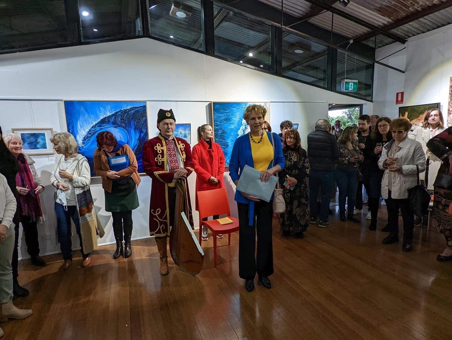
True Blue & a Little Bit of Yellow — UNITED. The second exhibition by True Blue & a Little Bit of Yellow expanded the circle. This time, Ukrainian and Australian artists came together, united by solidarity and a shared belief in the power of art to help.

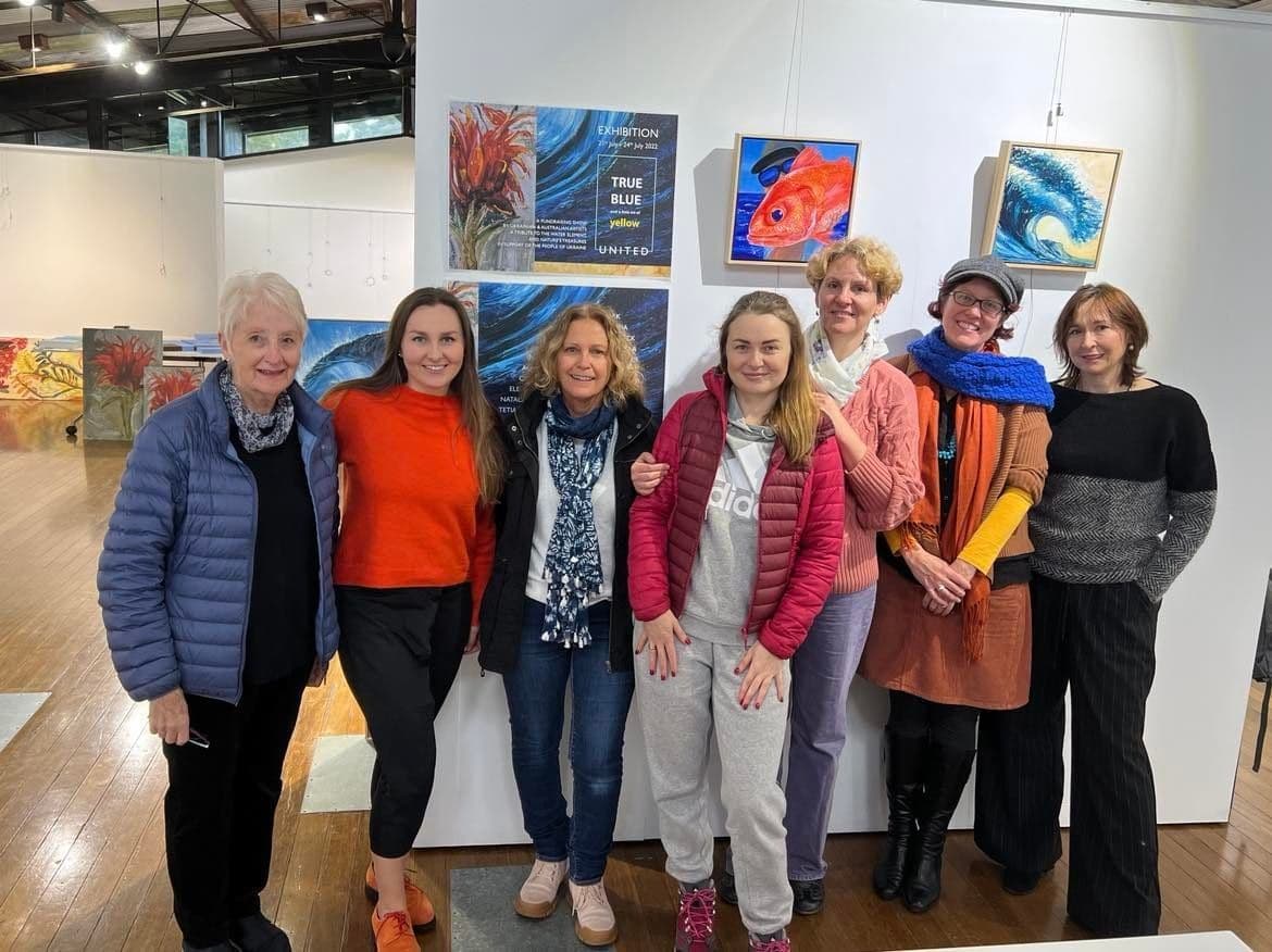
Seventeen artists participated in UNITED, a collective effort where local creatives gathered their talent for a clear purpose — to raise funds for humanitarian aid supporting Ukrainians affected by the war.
Held at Curl Curl Creative Space Gallery from 21–24 July, the exhibition became a meeting point of cultures, generosity, and creative voices. We are deeply thankful to everyone who took part, visited, supported the artists, and contributed to this cause.
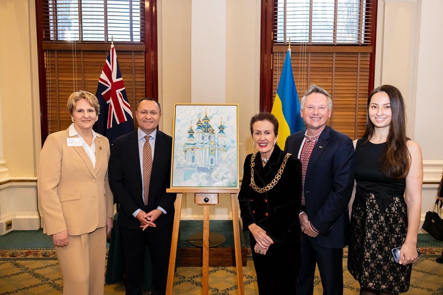
I’m deeply honoured that my painting, St. Andrew’s Church in Kyiv, Ukraine is now part of the City of Sydney Civic Collection. This artwork was officially presented in May 2025 by Andrew Mencinsky, President of the Ukrainian Council of NSW, to Lord Mayor Clover Moore and the City of Sydney—a gesture of gratitude for their ongoing support of displaced Ukrainians and our community since the beginning of Russia’s full-scale invasion in 2022. St. Andrew’s Church is a treasured Baroque gem of Kyiv, perched above the historic Podil district. Designed by Italian architect Francesco Bartolomeo Rastrelli in the 18th century, it stands as both a cultural icon and a spiritual beacon. This church holds a special place in my heart — my mum and grandfather were born not far from it, and during my art school years we spent many plein air sessions painting around its beautiful grounds. The presentation took place a month ago, but I was waiting for the official photos before sharing this moment with you. Australia’s support of Ukraine and part of my home city Kyiv, now represented in Sydney’s civic collection means more than words can express.
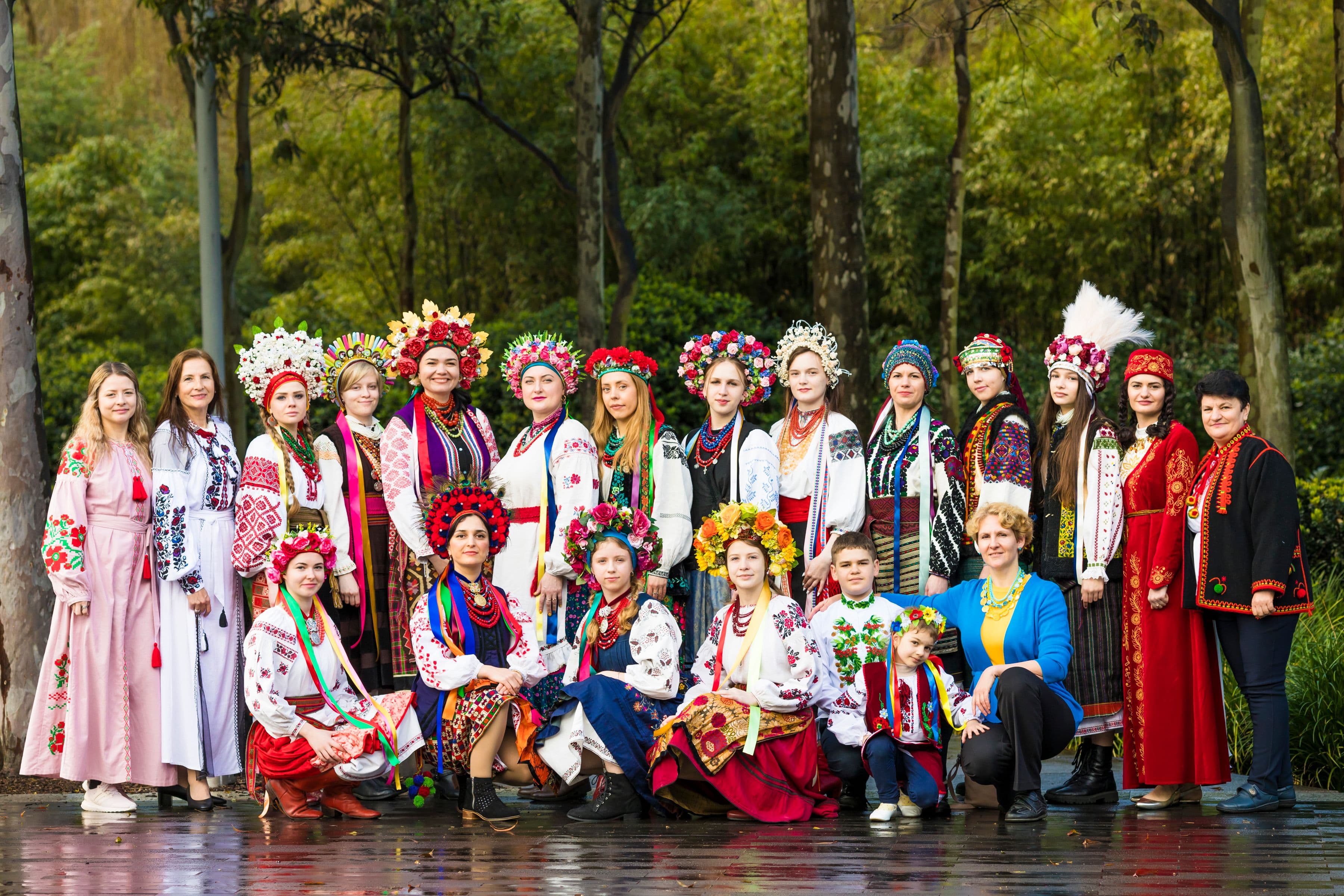
Cultural Performance at the Ukrainian Festival, Sydney — 2022. In 2022, I curated and produced a major cultural performance at Tumbalong Park, Darling Harbour as part of the Ukrainian Festival. The show was created primarily using the private collections of Roxolana Mishalow and Tanya Whitbourn, whose garments carried deep regional and historical significance. This performance was unlike any I had worked on before. All of the models were Ukrainian refugees. Each person on stage carried their own story of displacement, resilience, and survival, which gave the presentation an added layer of meaning that could not be staged or rehearsed. The vibrant regional costumes were intentionally contrasted with the visual narrative behind them. I designed a series of projected slides showing Ukrainian towns and cities before and after the war. Together, costume and imagery created a powerful dialogue — beauty and heritage set against destruction and loss. What emerged was more than a performance. It became a moment of collective remembrance and visibility, honouring Ukrainian culture while acknowledging the realities of war. Through this work, tradition was not frozen in the past, but stood firmly in the present — resilient, human, and deeply alive.