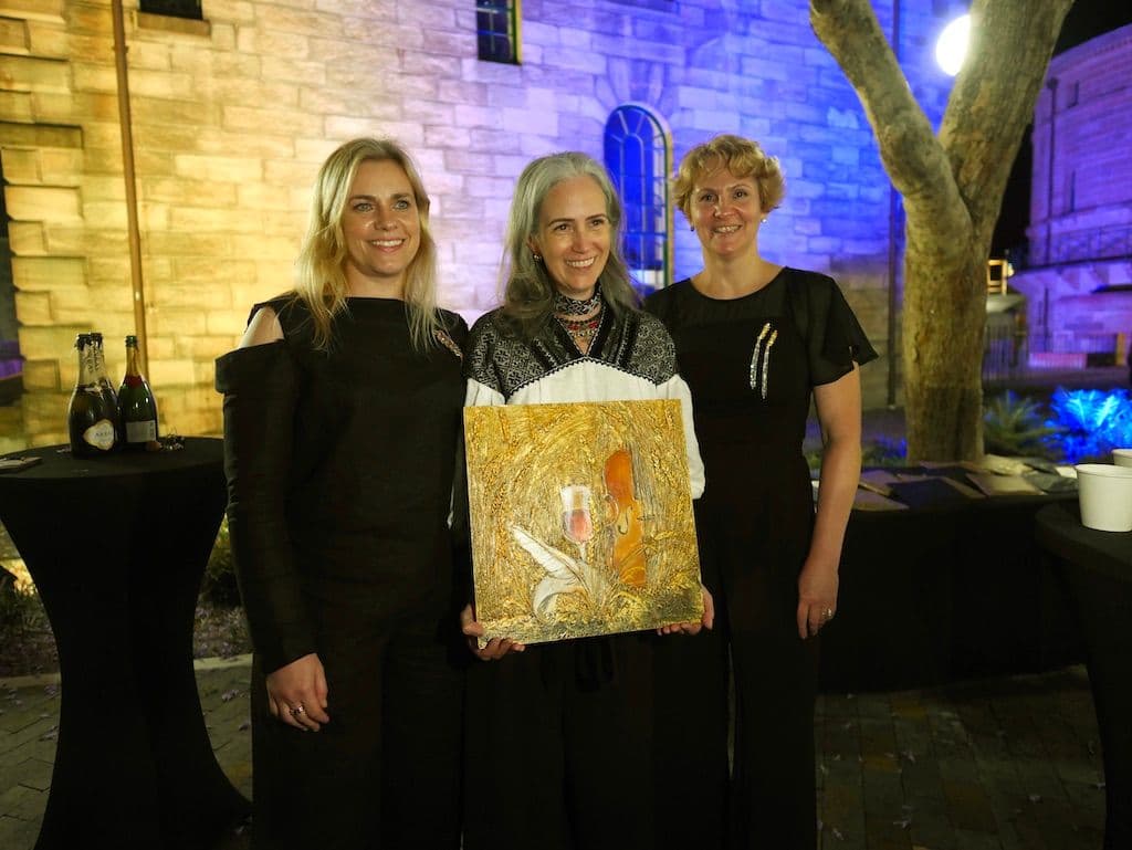
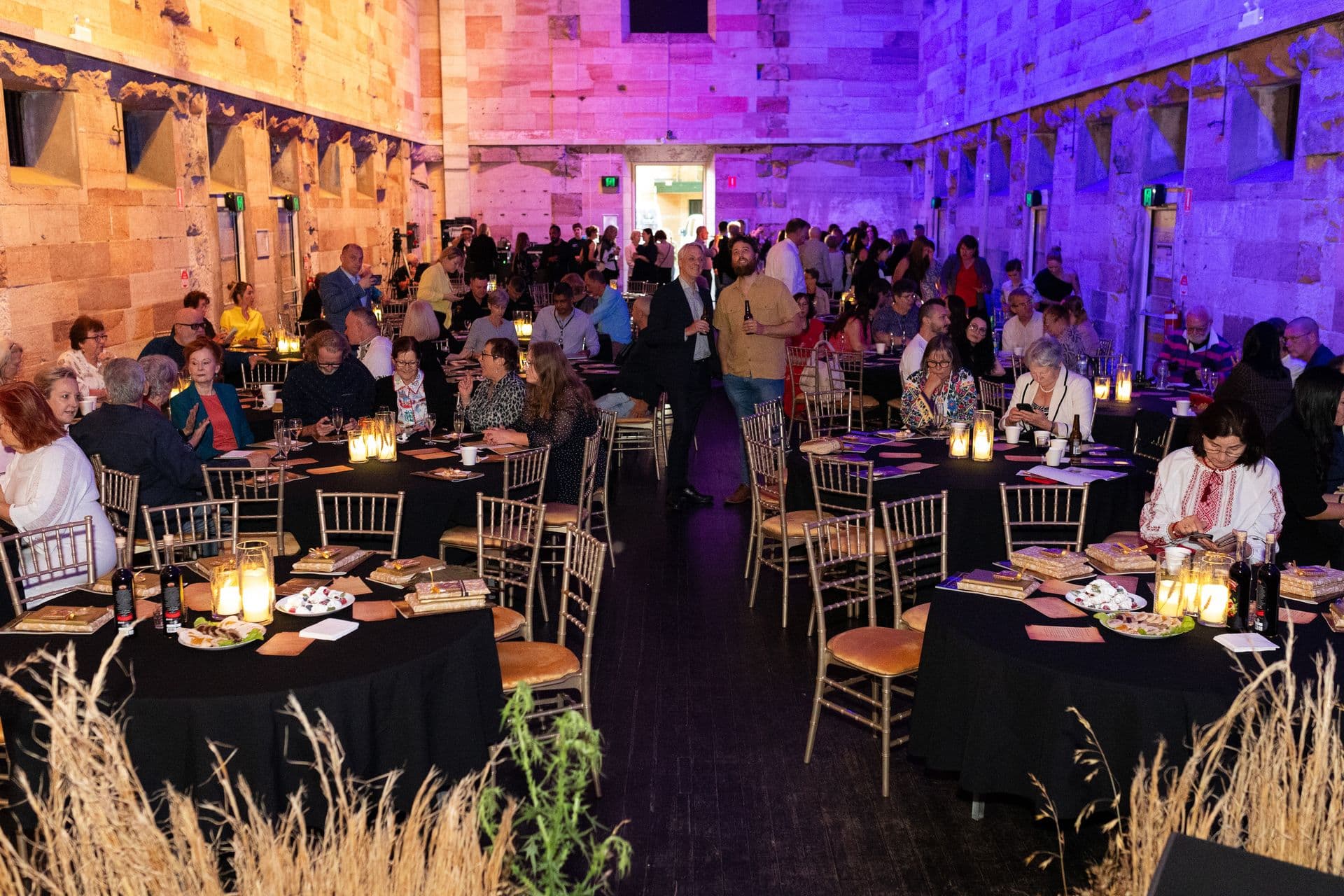
Being part of the Heartlands multimedia performance at Cell Block Theatre, Sydney, was a true privilege and an honour. It was a project driven by an incredibly motivated and generous team — a real dream team — and the result was powerful. A person, who came up with the idea of this unique event never held in Sydney before, creative director and producer of Heartlands – Linda Gough.
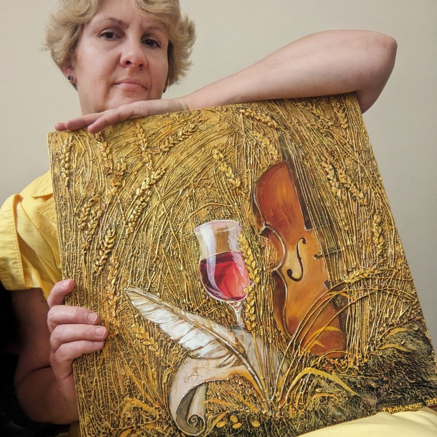
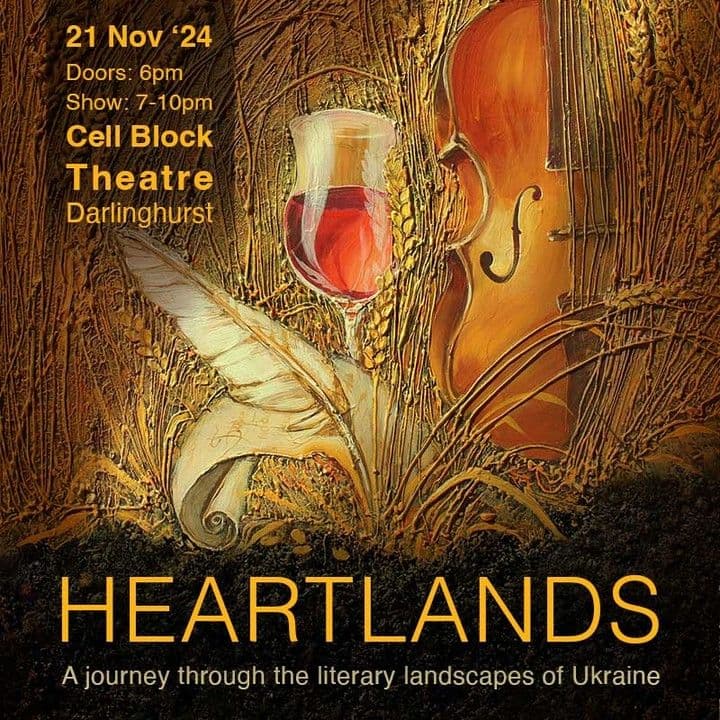
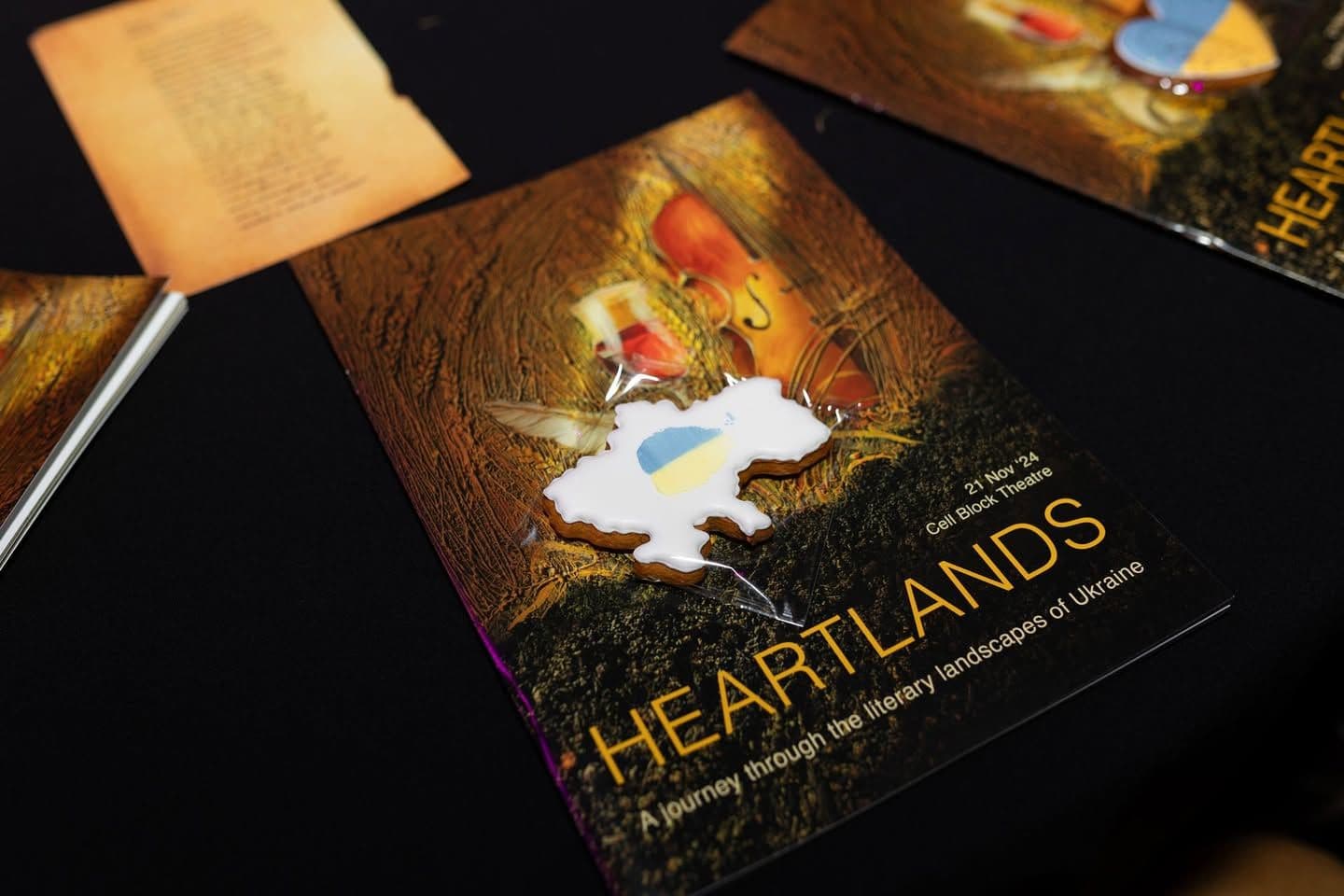
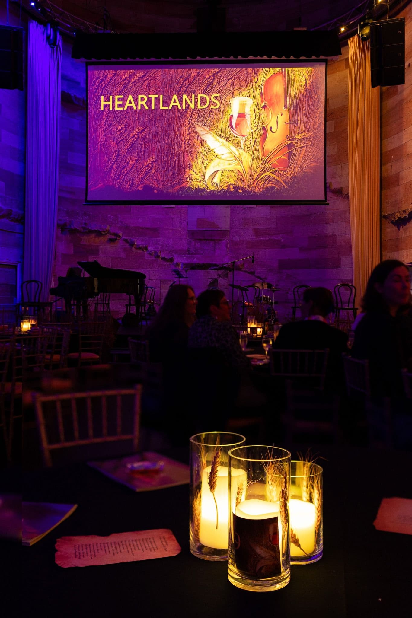
For this performance, I created the artwork of a golden wheat field rising from black soil. Ukraine is often called the breadbasket of Europe, and its fertile land has long nourished not only grain, but literature, music, and cultural memory. This image became the visual heart of the event, reflecting both abundance and endurance.
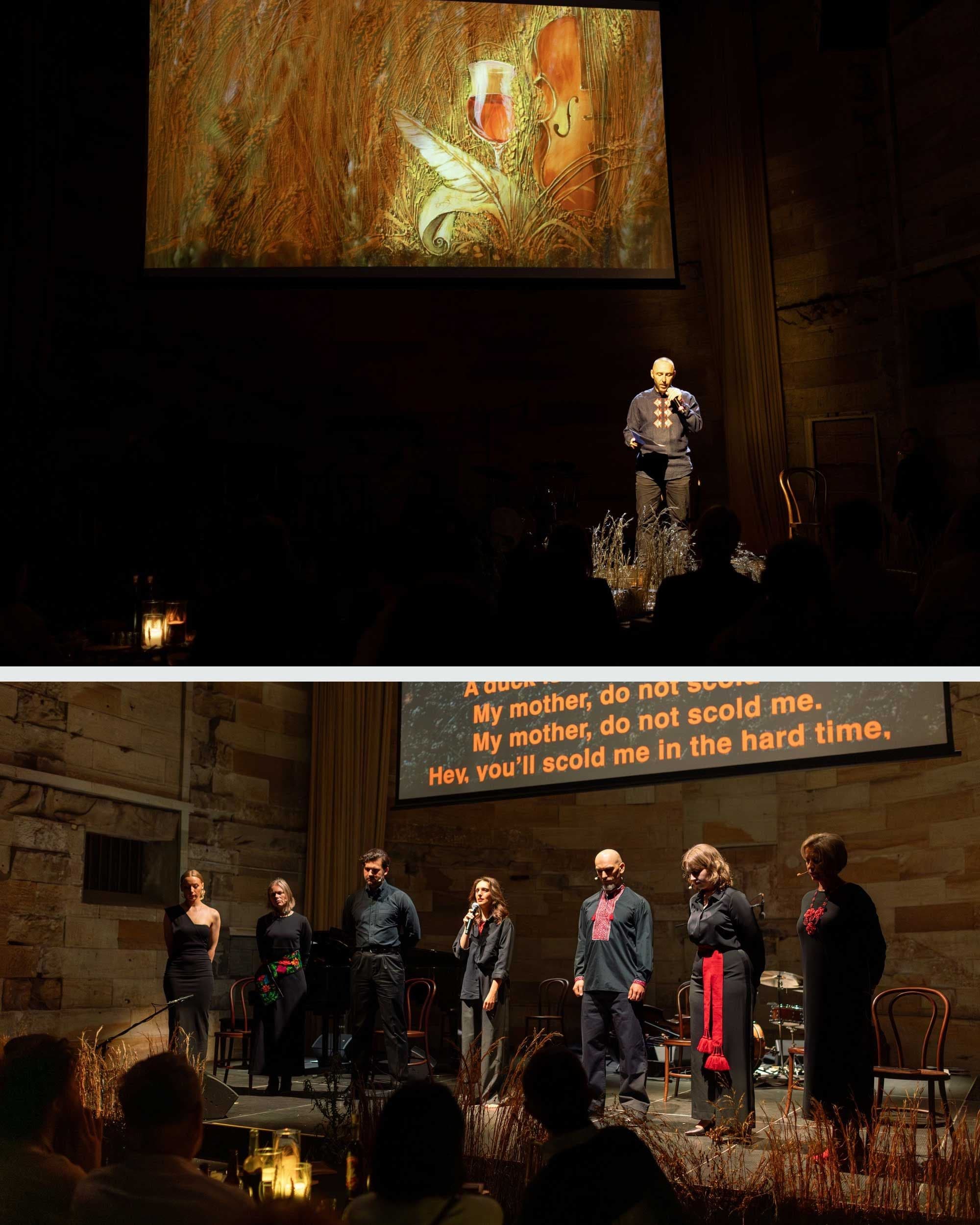
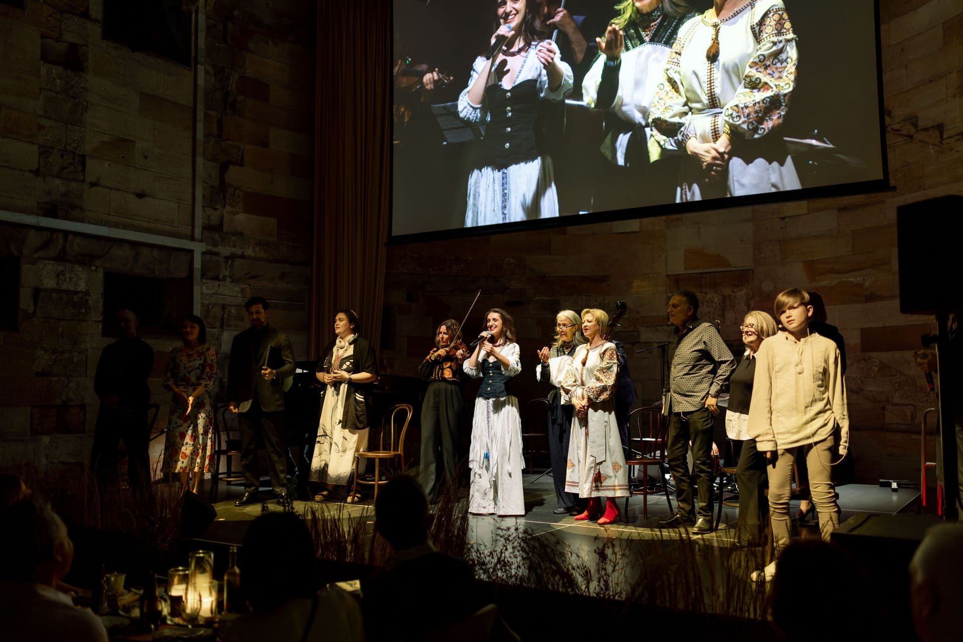
Heartlands offered audiences a deep experience of Ukrainian culture through poetry, music, storytelling, food, and shared presence. To my knowledge, it was the most substantial Ukrainian literary performance ever staged in the Southern Hemisphere, and I am proud to have supported it.
My role extended across the full visual identity of the event. I created the key artwork used throughout all materials, designed print collateral including posters, programmes, and food signage, developed digital assets for multiple platforms, and contributed to stage design. During the performance, my artwork formed the visual backdrop on the large screen behind the performers, shaping the atmosphere of the evening.
Heartlands remains one of the most meaningful projects I’ve been involved in — a genuine fusion of art, culture, and community, and a reminder of how creative collaboration can carry both beauty and purpose.
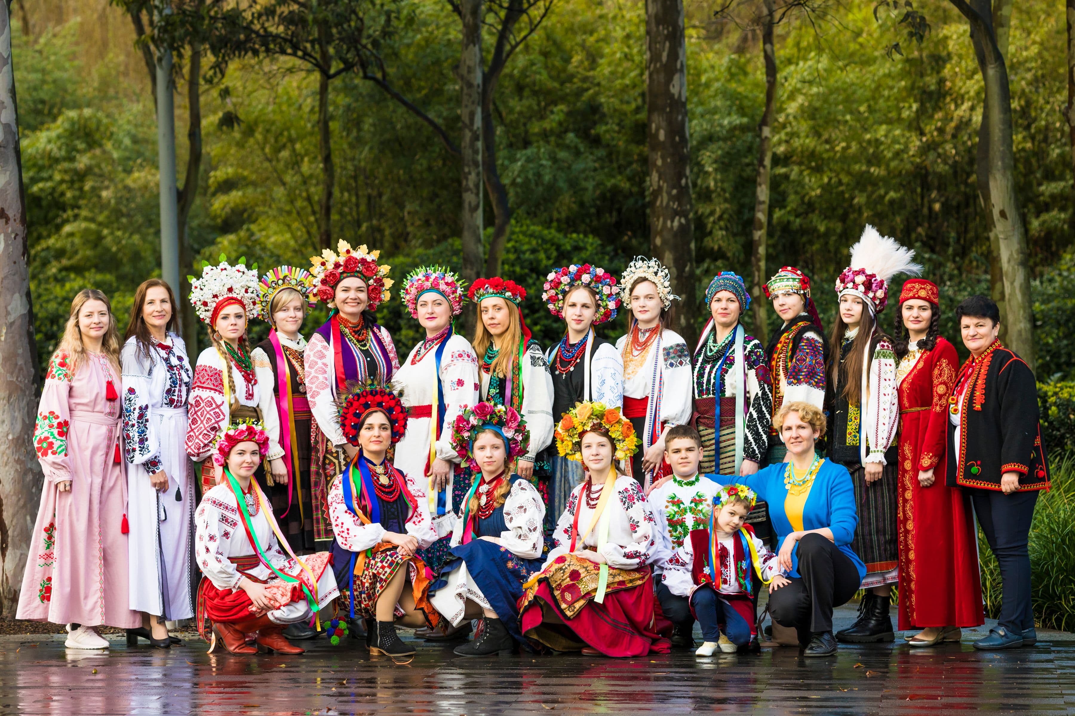
Cultural Performance at the Ukrainian Festival, Sydney — 2022. In 2022, I curated and produced a major cultural performance at Tumbalong Park, Darling Harbour as part of the Ukrainian Festival. The show was created primarily using the private collections of Roxolana Mishalow and Tanya Whitbourn, whose garments carried deep regional and historical significance. This performance was unlike any I had worked on before. All of the models were Ukrainian refugees. Each person on stage carried their own story of displacement, resilience, and survival, which gave the presentation an added layer of meaning that could not be staged or rehearsed. The vibrant regional costumes were intentionally contrasted with the visual narrative behind them. I designed a series of projected slides showing Ukrainian towns and cities before and after the war. Together, costume and imagery created a powerful dialogue — beauty and heritage set against destruction and loss. What emerged was more than a performance. It became a moment of collective remembrance and visibility, honouring Ukrainian culture while acknowledging the realities of war. Through this work, tradition was not frozen in the past, but stood firmly in the present — resilient, human, and deeply alive.

In August I am exhibiting my work in four group exhibitions across Sydney and one in Brisbane! If you're need to recharge your creative batteries this month, I'd love for you to visit one (or more!) of these exhibitions. Admissions are free. Throughout the month, you’ll be able to see my paintings in: Freedom and Sustainability 3–20 August 2026 The Gallery Ramp Space St Ives Village 166 Mona Vale Road, St Ives NSW 2075 The Winter Edit