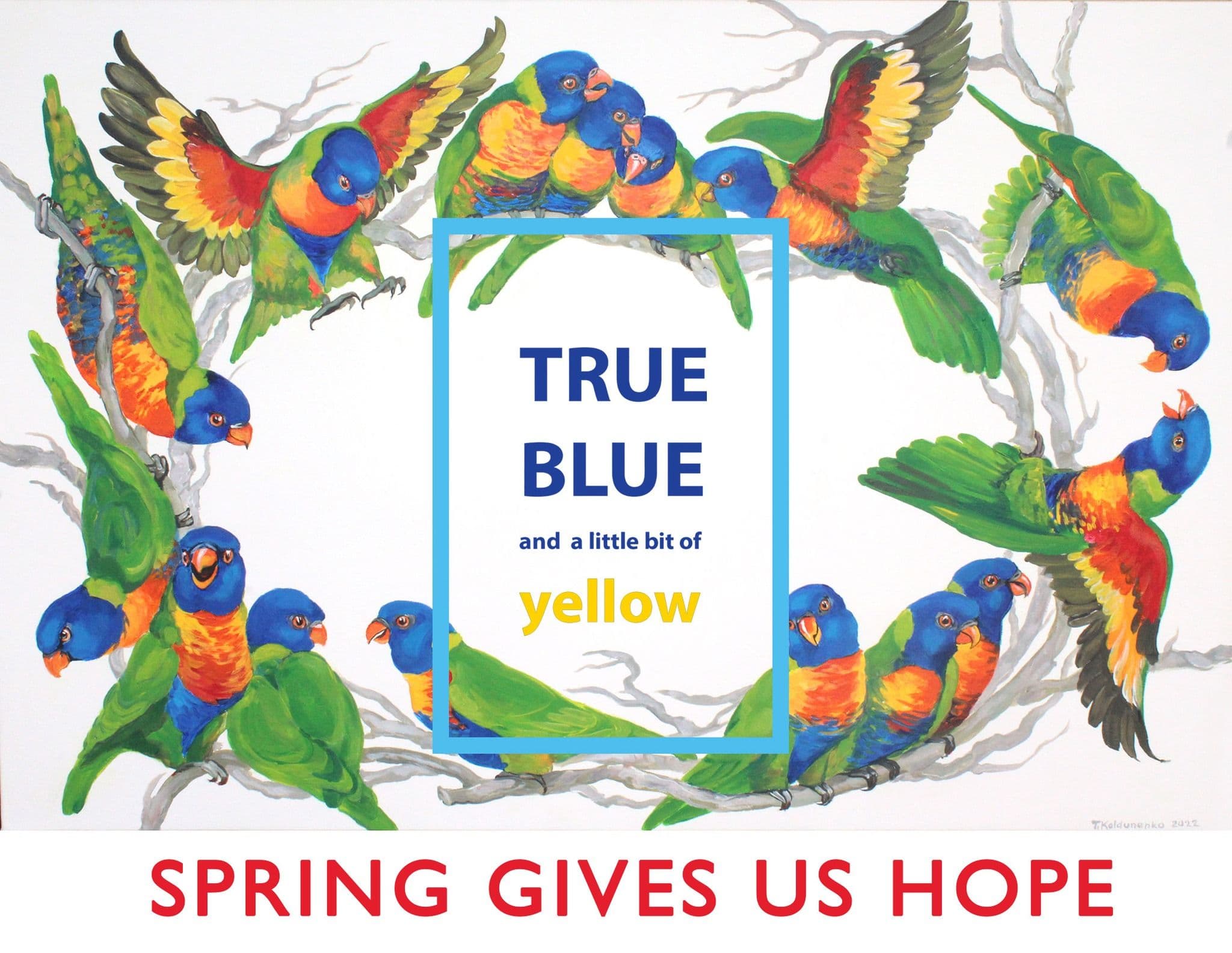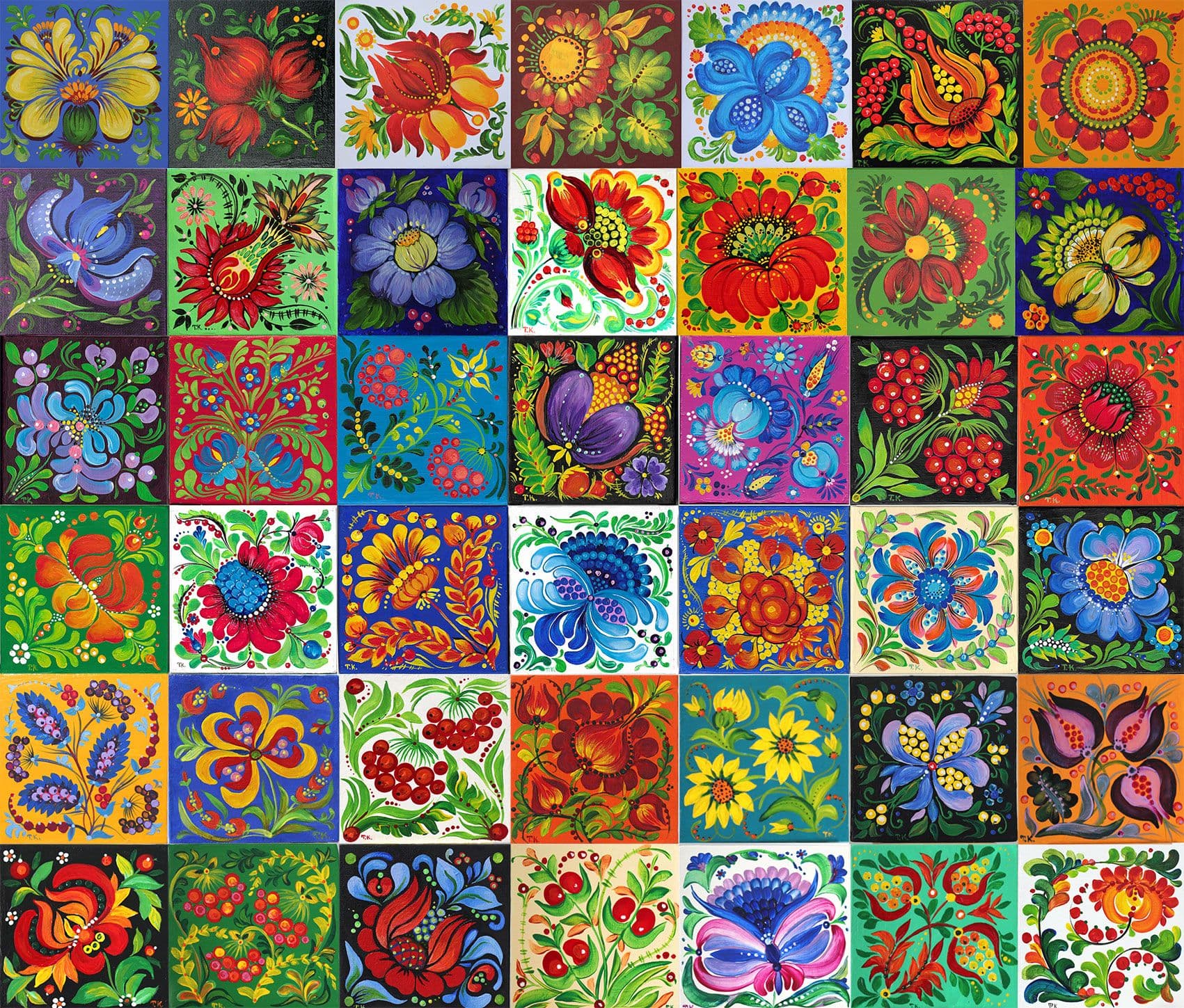
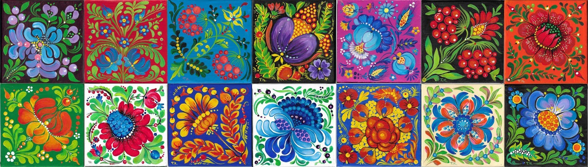
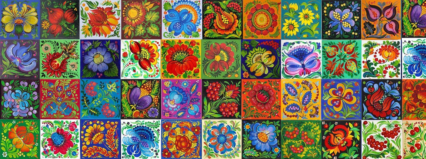
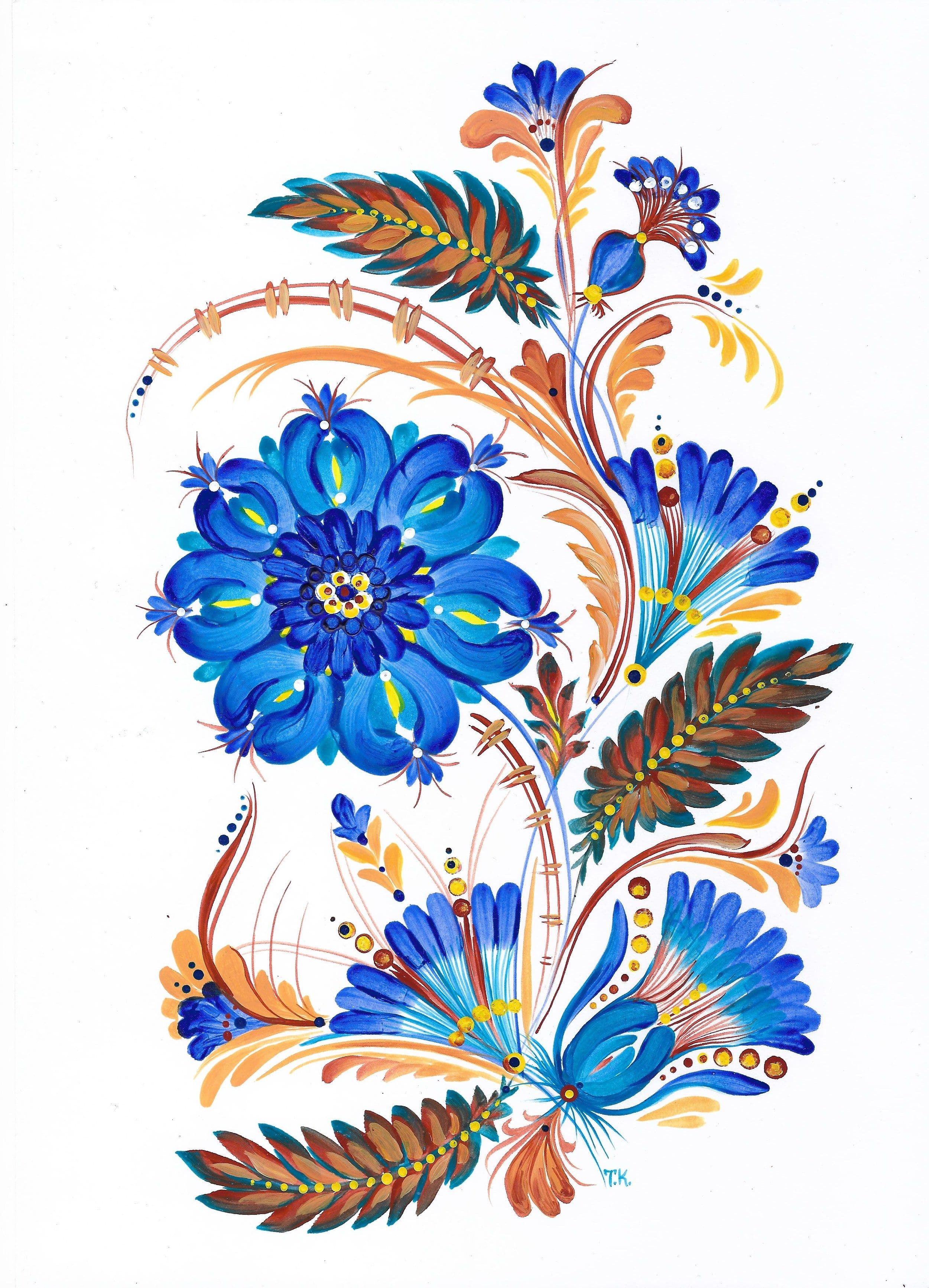
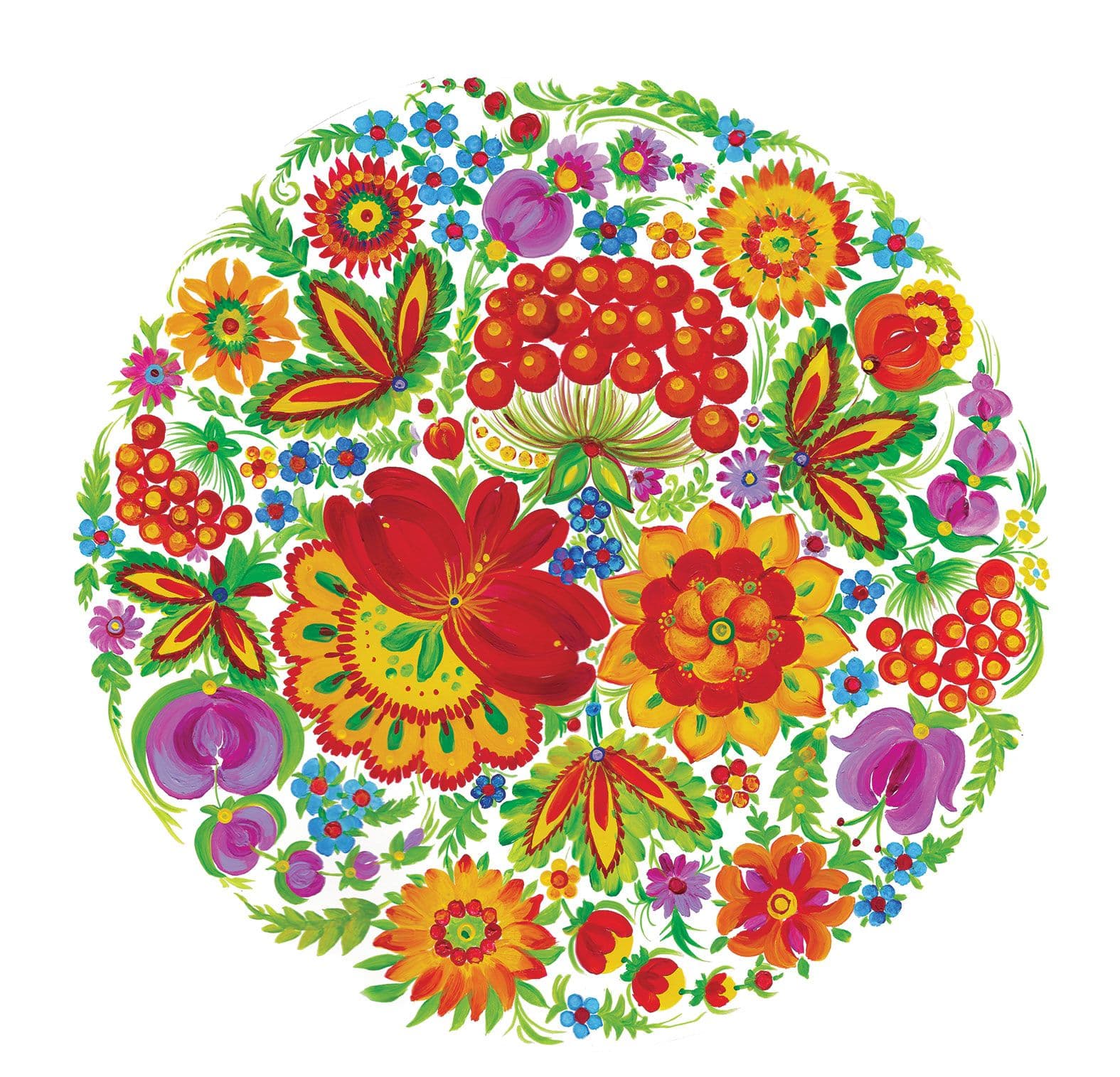
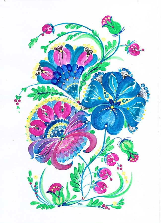
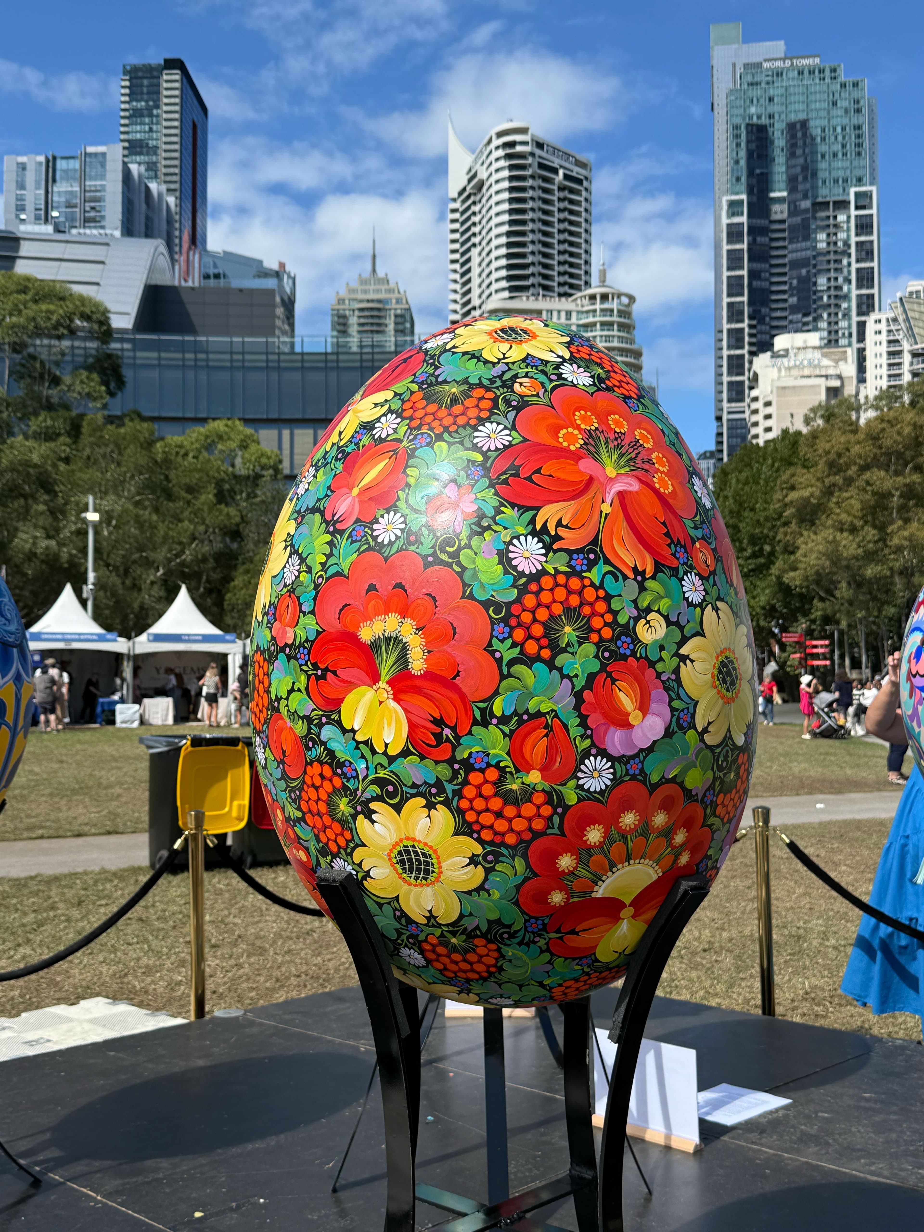
A Living Language of Colour. Petrykivka is a vibrant Ukrainian folk art style that originated in the village of Petrykivka. It is known for its intricate floral, natural, and animal motifs, traditionally painted on white backgrounds. These compositions symbolise harmony, life, and protection, and for generations have been used to decorate homes, everyday objects, and communal spaces. Today, Petrykivka is recognised by UNESCO as Intangible Cultural Heritage, acknowledging its role in preserving cultural identity through decorative painting.
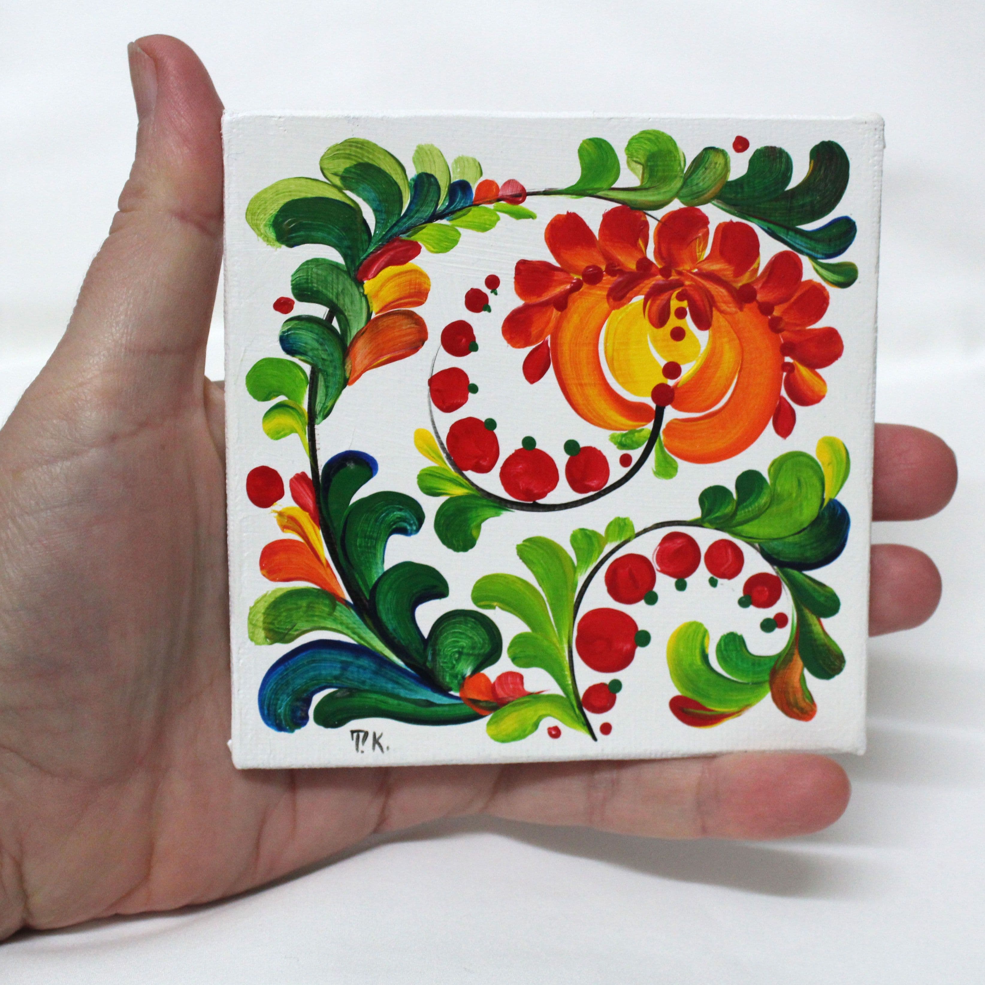
This tradition has always been close to my heart. What distinguishes Petrykivka from other painting styles is the way it is created — everything is built from expressive brushstrokes that feel like footprints left by different brushes and tools, sometimes even fingertip marks. Each stroke is visible, intentional, and alive, forming complex patterns through simple gestures.
Petrykivka is also unapologetically colourful, ornate, and joyful. Its energy comes from abundance rather than restraint, from movement rather than symmetry. These qualities resonate deeply with me. They speak of celebration, optimism, and a connection to nature that feels both playful and profound.
For me, Petrykivka is more than a decorative style. It is a visual language that carries memory, emotion, and identity — one that continues to inspire my work and reminds me of the power of colour, rhythm, and hand-made marks to tell stories across time and place.
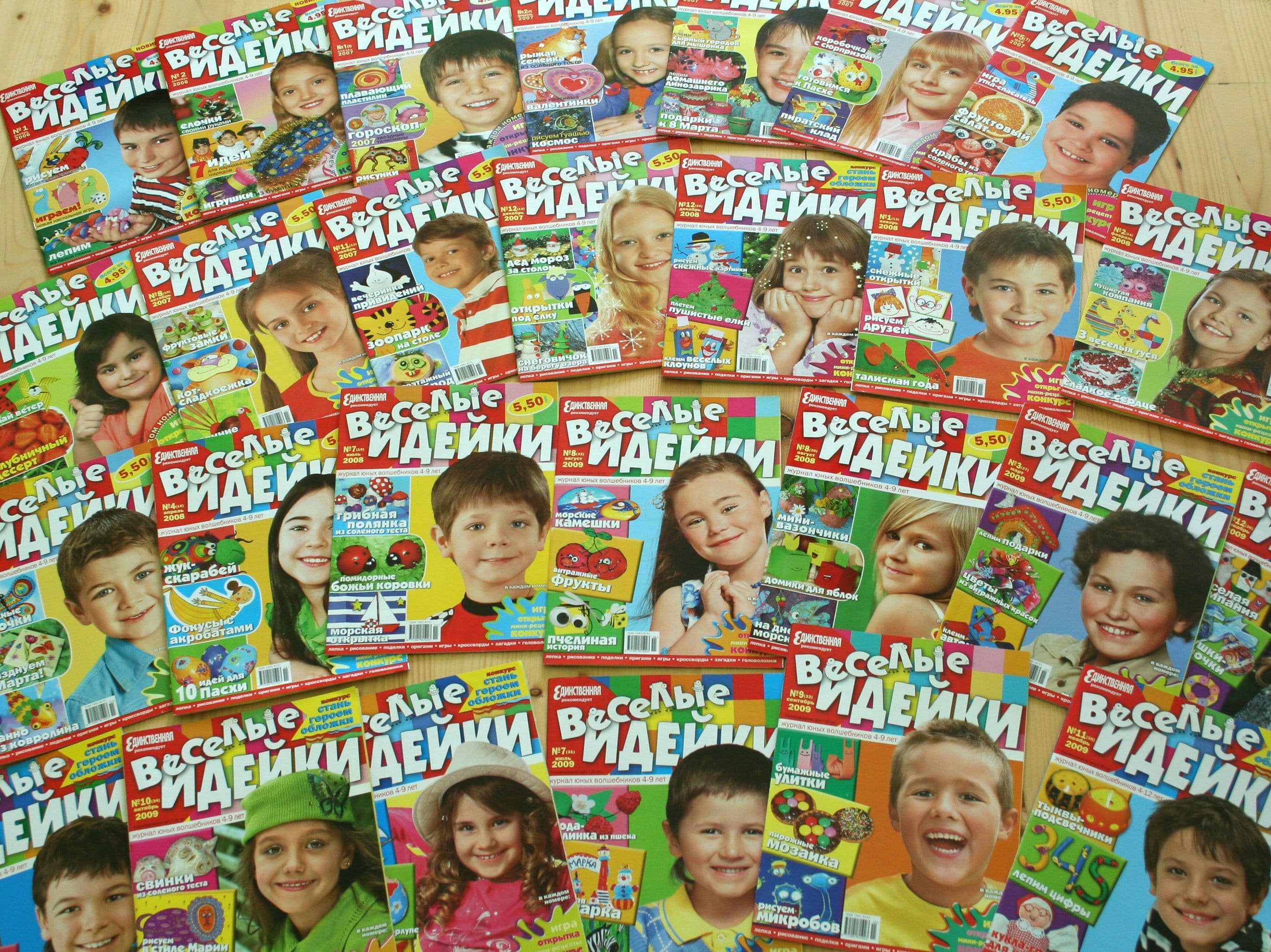
Before moving to Australia, I spent five formative years working at Edipresse Ukraine, an international publishing house. I began as a designer and illustrator and later took on the role of chief editor, alongside working as a photographer and illustrator. This period played a significant role in shaping my approach to clarity, storytelling, and creating strong, high-quality visual narratives. Between 2004 and 2009, I worked across a wide range of publications and roles: 2006–2009 — Chief Editor, Photographer, Designer & Illustrator, Fun Ideas (children’s craft magazine) 2006 — Designer & Illustrator, English Teen Club (English-learning magazine for teenagers) 2004–2008 — Illustrator, Horoscope (women’s magazine) 2005 — Designer, Marketing Department
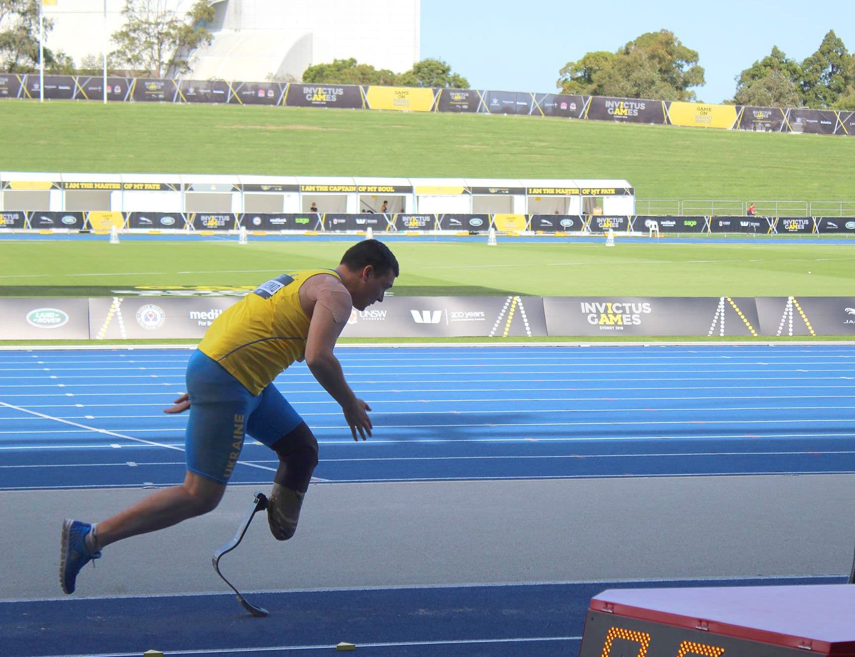
Photography is another way I tell stories. Through the lens, I focus on capturing the essence of a moment — and quite often, that essence is found in something simple and authentic, like a genuine smile. For me, photography is not about staging perfection, but about conveying mood, feeling, and the small details that make each moment distinct. My approach is grounded in clarity and intention: clean, uncluttered compositions mood-driven visual storytelling thoughtful styling, particularly in portrait work I enjoy creating portraits that feel natural, balanced, and well composed, as well as documenting events in a way that is honest, engaging, and true to the atmosphere of the moment. Whether photographing a performance, an event, or an individual, my focus remains consistent — imagery that communicates clearly and carries emotional weight.